Michael's Map Layers Custom Viz Extension
I love using Map Layers to build non-map chart types. Andy Kriebel introduced me to this idea as part of Next-Level Tableau and it changed the game.
I like talking about it at Tableau User Groups and Blake Feiza gave a great presentation on the topic at Tableau Conference 2026.
It's a really fun feature.
The gist
We borrow the map layers functionality to draw a point using MAKEPOINT(lat, long) on a blank, washed-out background map. We can then use the 'layering' of Map Layers to build whatever we want, one layer at a time.
However, there's a lot of moving parts:
-
Dealing with the coordinates
-
Remembering to swap the x and the y to account for lat and long,
-
What about the curvature of the earth.
-
Normalization if values exceed -90 and 90 or -180 and 180.
All these were part of the fun, but made map layers more difficult for all users to implement.
Just to see if we could, I set about building Michael's Map Layers Extension: a fun project to see if it was possible to create an extension where we can just point to a spot on a grid, without any calculations, and draw something there.
This continues my exploration of building custom Tableau Viz Extensions with AI-assisted coding.
This one felt like a BIG project. Anthropic had just released their Fable 5 model, so I took Claude, turned it up to 11, and set about seeing what I could build.
Personal project, just for fun. Not intended for use in business dashboards.
The three shelves
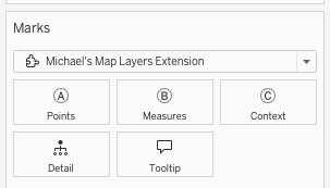
A - Points Drag a dimension onto it and each unique value becomes an available point on the canvas: Region, KPI Name, whatever level you want one anchor per value at.
B - Measures holds every value your layers might need: the numbers you show, the goals you compare against, even the x/y coordinates for one of the placement modes below.
C - Context is for supporting fields that don't become their own layer: a date field for sparklines and deltas, or a dimension for donut slices.
Adding a layer
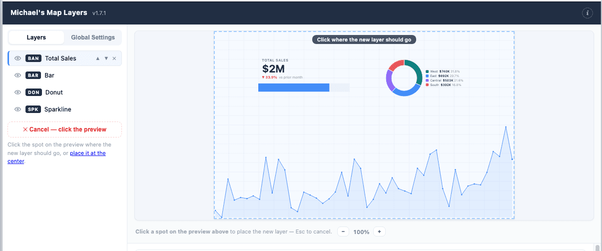
Click + Add layer, pick a point on the interactive preview grid, and then decide what to draw there.
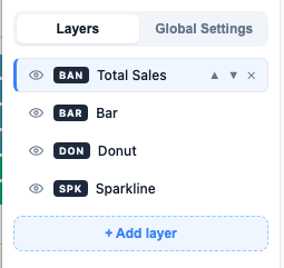
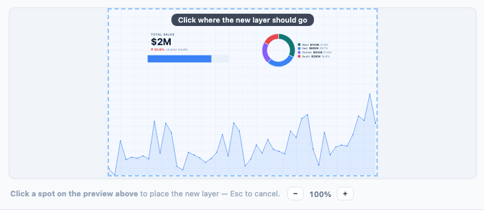
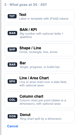
That's all there is to it. You don't need to write a MAKEPOINT calculation. You can click on point, or define it using the x and y menus.
You can go deeper on this by splitting the point up by your dimensions (e.g. with 1 layer you can get 4 points for region, rather than creating 4 layers). Little more on that below.
Once you have your point, pick what you want to put there. We have a few templates. See content types below.
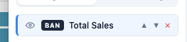
Once placed, a layer's content type is not fixed forever. Every layer gets a Duplicate and a Delete, and reordering with the up/down arrows changes its z-order (later in the list draws on top).
The content types
-
Text: multi-line, with
{Field}tokens and its own formatting: italic, underline, uppercase, line height, letter tracking, horizontal and vertical alignment, and an optional background fill with its own padding and corner radius, for label-chip looks. -
BAN/KPI: pick a metric, then choose whether it shows the Total or the Latest period (with an "As of" caption). Add a delta chip comparing to the prior period or the same period last year. An inline sparkline sits underneath, and its height now actually follows the box (an early version of this had a sparkline stuck at a fixed height no matter how tall you made the layer).
-
Shape/Line: circle (a true circle, sized to the smaller side of the box, not an oval stretched to fit), ellipse, rectangle with adjustable corner radius, a free line or arrow between two points, and diagonal arrows drawn corner to corner inside the box.
-
Bar: single, progress (against a goal), or bullet style. The goal can be a fixed number or another metric. Optional "% of total" alongside the value, rounded or square corners.
-
Line / Area Chart line, area, or both together, plus a "last N periods" limit so a date series doesn't try to cram three years of history into a two-inch box. Set it to 12 with a month bucket for a trailing twelve months, or 8 with quarters. Turn on X and Y axes when a trend needs to read as a real chart instead of a glance: gridlines and value labels (in the metric's own number format), a "start at zero" toggle, and axis color and text size. Gridlines and labels are separate switches, so you can keep just the numbers without lines running across the chart. Leave both axes off and it's the original minimal sparkline.
-
Column chart: bars against a date axis (with the same last-N-periods limit) or a dimension axis, with sorting and optional value labels above each bar. Gets the same optional Y axis and gridlines toggle as the Line/Area chart; the Y axis always starts at zero for bars, no toggle needed, since a bar chart that doesn't start at zero is lying to you.
-
Donut: slice by a dimension, with a max-slices cap that groups the rest into "Others," a center total, and a legend you can turn on to the right or below.
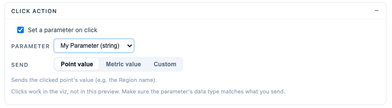
Every content type also gets its own Tooltip (a hover card, custom template or automatic) and Click action (push the point's value, a metric's value, or a custom template into a Tableau parameter on click, so the canvas can drive filters or other sheets).
Click action is one of my favorite features of this build. It allows us to make this viz extension interactive by passing whatever we want into parameters and driving different functionality if we see fit, all without setting up a parameter action.
Four ways to place a layer
This is the part I went back and forth on the most, because "map layers" really covers a few different placement problems, not one.
-
Manual: one anchor, you place it once by dragging or typing X/Y. Good for a title, a fixed legend, anything that only needs to exist once.
-
Auto layout: bind a Points field and every value gets its own anchor, arranged automatically in a grid, row, or column with spacing you control. Sort by data order, alphabetically, or by the layer's own metric value, ascending or descending, so your bars or BANs line up biggest-to-smallest without you touching a single coordinate.
-
Per value: every value still gets its own anchor, but you place each one by hand instead of letting a grid decide. A point list shows which values you've placed and which are still sitting in a temporary auto slot, so you're never guessing what's left to do.
-
From fields: x and y come directly from two measures, the actual MAKEPOINT-style workflow. Turn on "scale to fit canvas" and whatever range your two measures happen to be in gets normalized onto the canvas automatically, so you're not matching coordinate scales by hand the way the old technique demands.
Difference between manual placement or auto layout using dimensions
Auto layout and per value repeat a layer's content once per point value automatically. Set up a BAN once, and if Points has ten values, you get ten BANs, each reading its own slice of the data. Small multiples without copy-pasting a layer ten times.
For me, the per value and from fields modes were added to try and preserve some of the flexibility of map layers, but I think they only serve to confuse the build. They are difficult to understand without a full demo or long 'how to' guide. I kept them as a reminder to myself that an extension shouldn't try and do everything.
It's not just able placement. You can drag and resize everything all within the preview window.
The metrics registry
Every measure on the shelf becomes a metric automatically, and every renderer and token references metrics by id rather than touching a raw field. That sounds like plumbing, but it mattered in practice because of one specific case: Tableau's combined [Measure Values] / [Measure Names] pills. If someone drops Measure Values on Points, this needed to split that back out into one metric per underlying measure, each keeping its own native number format. That took real effort to get right, and it unlocked a mode I like: Points = Measure Names, one layer, and each point shows a BAN for its own measure, "the point's measure," picked automatically the moment it applies.
Ratio metrics (numerator over denominator) always aggregate as SUM(numerator) / SUM(denominator), never an average of pre-divided row values. There's a "Detect ratio pairs" action that scans your measure names for X (Num) / X (Denom) style pairs and suggests metrics. It suggests, it doesn't auto-add, so you stay in control of what gets created.
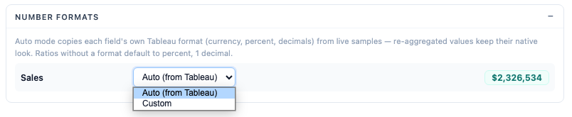
Number formats are inferred from Tableau's own formatting per field by default: currency stays currency, decimals match, and so on. Every layer can override that with its own custom format too, for the one BAN that needs to look different from everything else reading the same metric.
Bringing the default number format into the extension was huge. I didn't know it would be possible, but it's another example of turning an idea into a feature with AI-assisted coding.
Conditional formatting
BANs and bars can both be colored against a goal: a constant value or another metric, with a "higher is better" or "lower is better" direction. Good and bad each get a color chip, including a "None" option (a diagonal slash) if you only want to flag one state and leave the other at its default color.
BANs get five indicator styles: text color, a small dot, a left status bar, a top status bar, or the whole cell tinted. Bars just color the fill, and negative bars default to red automatically unless you've set your own good/bad colors.
Zoom, and the rest of the dialog
Zoom to layers frames the visible canvas around just the layers you've actually placed instead of the full 0 to 100 grid, useful the moment your content clusters in one corner rather than spreading across the whole space.
The config dialog itself got a lot of attention. A true-to-scale live preview renders at the same size as your actual dashboard zone, so text and bars preview at their real relative scale instead of looking oversized in a tiny dialog, with its own zoom control for fine placement work.
Drag and resize happen directly on that preview. An Apply button pushes changes to the live viz without closing the dialog. Every color field opens a palette-first picker (your theme colors, Tableau 10, neutrals) with the native OS picker as a fallback. And an info overlay in the corner explains all of the above without leaving the dialog.
What I'd reconsider
Four placement modes is a lot of surface area for one concept ("where does this go"), and I went back into the per-value and from-fields modes more than once to add clarity (handle labels, a point-list, an off-canvas warning on the fields position table) that probably should have been there from the first pass. If I were starting over I'd nail down the placement UX on paper before writing any layer content types at all, since every content type has to work inside all four modes.
This was one of the more substantive builds I've done with Claude Code. Using Fable during the promotional re-release of the model was fun but it burned tokens like crazy. It would take even more now we are out of that promotional window.
The Measure Values splitting, the point's-own-measure mode, the zoom-to-layers view transform, and the placement UX work were all genuine engineering problems, not "change this to blue."
In closing
Like my other builds, this was a project to see what is possible with an idea and AI-assisted coding. It's not intended to become a new extension for people to use. This tool is too general. I find Custom Viz Extensions shine when being used to solve a very specific problem.
That said, this is a cool build. I really enjoy the challenge of loading in features and how to design a UI to handle them. Something I did not expect was that the build of the config menu is far and away my favorite part of building viz extensions.
I iterated a lot more than I should have (try not to look at the version number). AI-assisted coding makes it easy to iterate, refine and build something really bespoke.
Check out the extension below. Moreover, try building your own extension. 2 weeks ago I had never loaded a viz extension in Tableau and now I've built 4 of them, each increasingly complex.
Give it a go
Clips in a blog is fun, but try it hands on.
What you need
-
Tableau Desktop: the free version works. This will not work with Tableau Public Desktop.
-
A data source with at least one dimension for Points and one measure. Superstore works for testing.
Steps
-
Download map-layers.trex
-
Open Tableau Desktop and connect to your data source
-
Create a new sheet and change the marks card to Add extension
-
Click Access Local Viz Extensions and select the downloaded
.trexfile -
Accept the security prompt. The canvas will appear
-
Drag a dimension onto Points, measures onto Measures, and optionally a date onto Context
The full source is on GitHub.
Let me know what you think. What would you add/remove? What kind of custom Viz Extensions would you like to build?
Michael's Map Layers Extension is a v1 release created by me as a personal project and demonstration of AI-assisted viz extension development. It is provided free of charge for educational and demonstration purposes only. It is not recommended for production use in live dashboards or business-critical reporting without thorough testing in your own environment. I make no warranties, express or implied, regarding accuracy, reliability, or fitness for any particular purpose. Use entirely at your own risk. I am not liable for any data discrepancies, losses, or issues arising from use of this extension.