Super Table Viz Extension
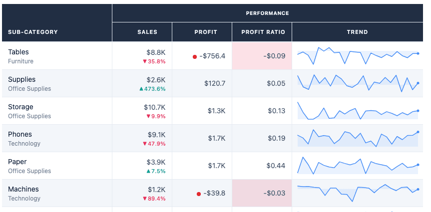
Every analyst has been asked to add one to a dashboard (or worse yet, it was the dashboard), yet Tableau doesn't excel when it comes to natively building tables.
I spend a lot of time building tables with work arounds and hacks (dummy fields, pretend axis, map layers) to try and make them look decent. What would be great is having an extension that was feature-rich and fun to use, so here's my attempt at building a Custom Super Table Viz Extension.
I wanted some standard features currently missing from tableau, like resizing column widths (even having different sizes for measures), user-friendly sorting on fields and multiple items per cell. But also wanted to expand features that are difficult to pull off in Tableau like conditional formatting, sparklines, independent tool tips etc.
I really wanted to focus on the UI of the settings menu here to see how many features I could add in without overwhelming the UI and becoming difficult to use.
So with AI-assisted coding with Claude Code, I set out to build a Custom Super Table Viz Extension!
Resize, sort, quick build multi-items in one cell
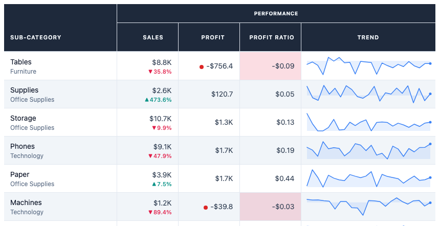
Sparklines and conditional formatting against a goal
Period-over-Period comparisons, nested columns, global settings and themes
Just a few of the ways you can quickly and easily customize build better tables using a custom viz extension.
How it was built
This was my second attempt at building this extension.
The first attempt happened before I'd built anything with the Extensions API. I jumped straight in with a big ambition trying to add every option I could think of all up front. I had no real scaffolding to work from. It didn't go so well. The UI had no clear structure, I couldn't debug simple rendering issues, so I shelved it.
I then built a KPI card viz extension and learned some important things along the way. Eric Summers' helped out massively by sharing a skills file: a structured prompt context that gives Claude a working knowledge of the Tableau Extensions API: a list of instructions to Claude upfront on important steps it should take for every viz extension build and (more importantly) the pitfalls to avoid.
Starting from that foundation rather than from scratch made the first prompt dramatically more productive. The scaffolding was right, the API patterns were right, and I wasn't spending the first hour debugging things that had known solutions.
What was great was I could add and subtract from the skills file to make it fit my style and preference for building.
From there it became a different kind of problem: not can I build this, but how much should I build?
So my goals were:
-
Build custom tables in a user-friendly way
-
Focus on the UI of the Settings/Config menu
-
See what you learn along the way
How to use the extension
The three shelves
Super Table uses three encoding shelves on the marks card. Understanding what each does is the foundation of everything else.
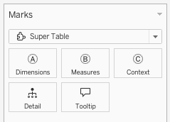
Dimensions define the row grain. Each unique combination of dimension values becomes one row. Drag in Category, Sub-Category, Region, Customer Name: whatever level you want to report at. Multiple dimensions create a compound grain, the same way they would in a standard Tableau table.
Measures become your columns. Drag in as many as you need. Each measure gets its own column, and each column is configured independently: its own format, its own conditional formatting rules, its own sparkline settings. There is no shared formatting that bleeds across columns.
Context is for supporting fields that inform the table without appearing as columns themselves. The most common use case is a date field for sparklines: drag Order Date onto Context and every measure column with sparklines enabled will use it as the time axis. Context fields don't show up in the table. They live in the background and can be added to cells without creating their own column.
What you get out of the box
Load the extension with some fields and you immediately get:
-
Alternating row striping
-
Sortable column headers (click to cycle asc → desc → off)
-
Column resize handles on every header
-
Row height drag-to-resize
-
The Super Table default Slate colour palette
No configuration needed for any of that. It's the baseline.
The Settings Menu
This was never the intent, but designing a settings menu became my favorite part of building viz extensions.
A good UI allows you to add more features without overwhelming the user.
Here are the highlights
The column editor
Click the ⚙ gear icon to open the settings dialog. The left panel lists every column on your Measures shelf. Select a column and the right pane shows all of its settings.
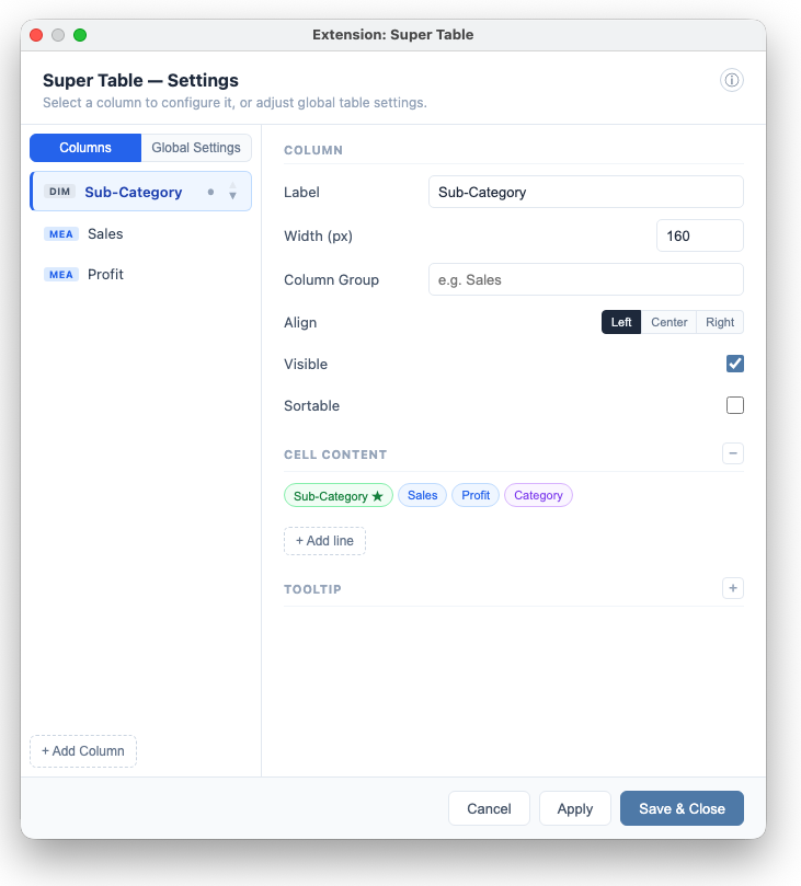
Here's what each section does.
Cell content
Override the column header label, set a fixed pixel width, and choose text alignment. Useful when the field name from Tableau is long or not what you want users to see. Quick add fields from your marks card using these color-code chips:

Metric format
The format section controls how values are displayed in every cell of that column.
-
Type: Number, Currency, Percentage, or Rate. Choose Rate for ratio measures (more on that below).
-
Prefix / Suffix: for custom formatting, e.g. "×" or " hrs"
-
Decimal places: 0–4
-
Abbreviate: toggle on to show $85,175 as $85.2K. Applies to values ≥ 1,000.
These are per-column. Sales can be currency, Profit Ratio a percentage, and Order Count a plain integer, all in the same table, with no calculated fields.
Conditional formatting
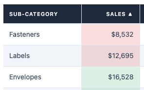
Conditional formatting is the most visually impactful feature. Set a goal value, tell the extension whether higher or lower is better, and every cell in that column is automatically coloured based on performance.
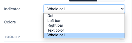
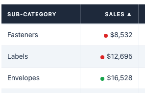
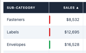
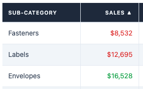
Indicator styles: four options, each suited to different table designs:
-
Dot: a small coloured circle to the left of the value. Clean and unobtrusive, good for dense tables.
-
Left bar: a short coloured bar pinned to the left edge of the cell, with a small gap top and bottom. Draws the eye down the column quickly.
-
Right Bar: like a left bar, only to the right.
-
Text colour: the value itself changes colour. The most minimal option.
-
Whole cell: a semi-transparent background fill at 15% opacity. Visible from a distance, good for dashboards viewed on screens across a room.
Colours: six chip options each for good and bad, plus a "None" option (diagonal slash) if you only want to colour one state. The None chip means the value stays the default text colour, which is useful when you want to call out problems without making everything else green.
Sparklines
Enable a mini trend chart inside the cell. Requires a date field on the Context shelf. If Context is empty, the sparkline toggle won't appear. Once enabled, the sparkline uses all date values from your data, respecting whatever filters are applied to the worksheet.
Period-over-period (PoP)
Show how each row's current value compares to a prior period. Toggle on, pick your comparison window, and the cell shows the percentage change alongside the value, in your chosen good/bad colours.
You can also toggle on a "vs [period]" label that names the comparison period. Useful when the comparison window isn't obvious from context.
Tooltip
Add a custom tooltip that appears when a user hovers over a cell. Use {Field Name} tokens to pull in any field from your Dimensions, Measures, or Context shelves. Write supporting context, comparisons, or calculated text directly in the tooltip template. No Tooltip shelf calculations required.
Global settings
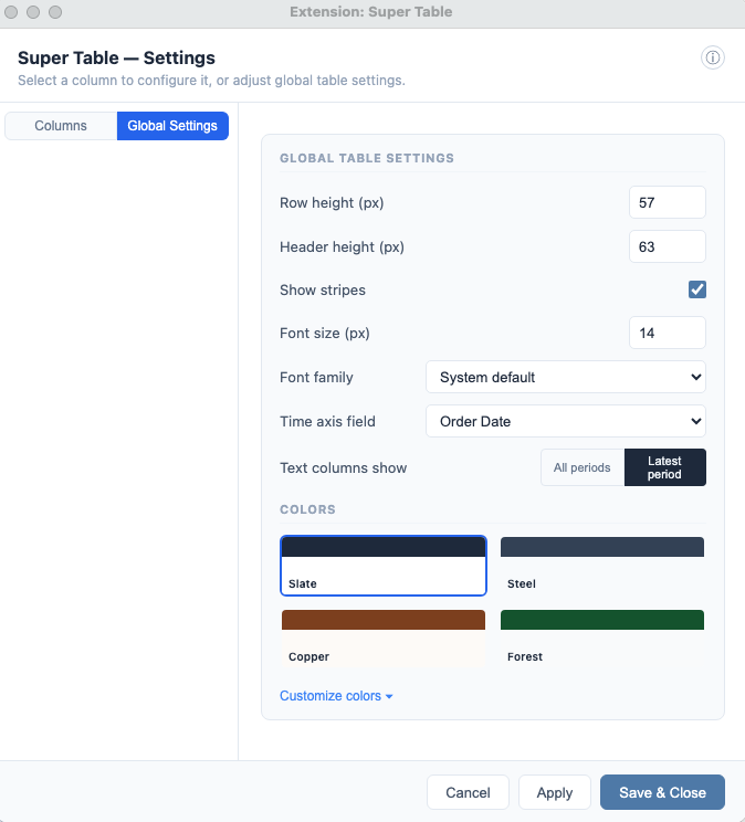
The second tab in the left panel, Global Settings, applies across the whole table.
-
Font family: System, Inter, Georgia, DM Sans, Poppins, Mono
-
Font size: 12–18px
-
Colour palette: Slate (default), Ember (warm dark), Steel (corporate blue), Indigo (bold accent)
-
Row height: or drag any row's bottom edge to resize
-
Column groups: set the same group name on multiple columns and a spanning group header appears above them. Useful for separating actuals from targets, or current year from prior year.
Building a ratio metric (and why it needs a different approach)
This is the most important thing to understand when using Super Table with ratio measures like profit margin, conversion rate, or any metric defined as one number divided by another.
When you drag AGG(Profit Ratio), or any pre-calculated ratio field, directly onto the Measures shelf, you will get the wrong answer.
Here's why. Tableau's viz extensions receive row-level data from the worksheet. One row per order, not one row per category. When Super Table aggregates that data to build the table, it sums what it receives. Summing individual order-level ratios gives a meaningless inflated number. It's not a bug in Super Table, it's the fundamental contract of the Extensions API.
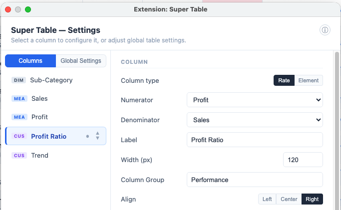
The correct approach is to build the ratio inside Super Table using a custom column.
Drag the raw source fields, both the numerator and denominator, onto the Measures or Context shelf. They don't need to appear as visible columns in the table; they just need to be present on the shelf so their data flows through to the extension. Then in the column editor:
-
Click + Add custom column at the bottom of the column list
-
Set the column type to Rate
-
Select your Numerator field from the dropdown: any Measure or Context field on the shelf is available
-
Select your Denominator field the same way
-
In Cell Content, use the
{Rate}token to display the computed result
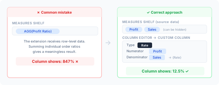
For Profit Margin the setup would be:
-
Measures shelf →
ProfitandSales(source data, you can hide these as columns if you don't want them visible in the table) -
Custom column → Numerator:
Profit· Denominator:Sales -
Cell Content:
{Rate}, displays the correctly computed margin per row
Super Table then computes SUM(Profit) / SUM(Sales) at the grain defined by your Dimensions: the mathematically correct ratio per category, sub-category, or whatever level you're reporting at.
When do you not need this? If your data source is already aggregated to the table grain before it reaches the extension (a custom SQL or extract returning one row per category), then dragging a pre-calculated ratio field directly onto Measures will work. The problem only occurs when the extension receives more granular data than the final row grain, which is the typical case with Superstore and most transactional sources.
What you can build
The flexibility of the column editor means Super Table works across a wide range of table types. A few patterns that work well:
Executive summary table: Dimensions: Region or Segment. Measures: Revenue, Profit, Margin %, Orders. Conditional formatting on Margin % with dot indicator. No sparklines. Clean, minimal, shareable.
Performance tracker: Dimensions: Product Category, Sub-Category. Measures: Actual, Target, % to Target. Conditional formatting on % to Target with whole-cell style. PoP on Actual. Every row immediately signals on-track or off-track without reading the numbers.
Trend table: Dimensions: Customer name or product. Measures: current period values. Context: Order Date. Sparklines on every measure column. Each row tells a story across time without a separate chart sheet.
Multi-metric scorecard: Dimensions: KPI name. Measures: Value, Prior Period, Change %. Column groups separate "Current Year" from "Prior Year." Good for weekly or monthly reports shared across a team that need to be consistent every time.
Get started
What you need
-
Tableau Desktop: the free version works. This will not work with Tableau Public Desktop.
-
A data source with at least one dimension and one measure. Superstore works perfectly for testing.
Steps
-
Download supertable.trex
-
Open Tableau Desktop and connect to your data source
-
Create a new sheet and change the marks card to Add extension
-
Click Access Local Viz Extensions and select the downloaded
.trexfile -
Accept the security prompt. Super Table will appear
You'll see an empty state until you drag fields onto the marks card shelves. The full source code is on GitHub.
Super Table is a v1 release created by me as a personal project and demonstration of AI-assisted viz extension development. It is provided free of charge for educational and demonstration purposes only. It is not recommended for production use in live dashboards or business-critical reporting without thorough testing in your own environment. I make no warranties, express or implied, regarding accuracy, reliability, or fitness for any particular purpose. Use entirely at your own risk. I am not liable for any data discrepancies, losses, or issues arising from use of this extension.